AI Advisor
This project is currently in development. I'm happy to walk through the full research and design details in a conversation.
Enter the access password, or reach out to request access.
Incorrect password. Try again or get in touch.
AI Advisor — Helping Educators Find, Prepare, and Teach
I lead UX for an AI assistant that helps educators find course materials and prepare to teach them. Across seven studies, research reshaped how the Advisor presents results, how it earns trust, and how it builds a teaching note with an educator.
The Challenge
HBP's catalog is deep. That depth is its value, and it's also the problem. An educator building a course has to find the right cases among thousands, judge whether each fits their level and goals, and then prepare to teach it.
The Advisor puts a conversational assistant alongside the catalog to help with that work. The design question wasn't only whether the AI gives good answers. It was how an assistant fits into the way faculty already work without costing them context or trust.
- Job 1: natural-language search and discovery, plus Coursepack Refresh.
- Job 2: brings Case Notes, our AI-generated teaching notes, into the Advisor.
- Job 3: Educator informed improvements.
The Research Program
Seven studies across eight months — from a global naming survey to hands-on sessions in a staging environment.
| When | Study | Method | Participants |
|---|---|---|---|
| Early 2026 | Naming | Qualtrics survey, 5 candidate names | Educator Panel (global) |
| April | Desktop Advisor | Moderated sessions, Figma prototypes | 6 educators |
| April | Mobile Advisor | Unmoderated, 3 variants, within-subjects | 28 educators via UserTesting.com |
| May | Model testing | 60-min moderated sessions on the live model | 11 educators, 7 countries |
| June | Alpha (2–4 weeks) | Post-use and two-week wrap-up surveys | 34 and 24 responses |
| July | Alpha debrief + Case Notes concept test | Moderated, 2 Figma flows | 5 alpha educators |
| September | Case Notes hands-on alpha | Solo use in staging, then 45-min interview | 8 educators |
Job 1: Search and Discovery
Naming the assistant
Before design feedback, I ran a naming study with our global Educator Panel. It looked at connotation and emotional reaction as well as preference, because a name that works for a US business school professor may land differently elsewhere.
"Advisor" was the strongest choice. It already means something in academic settings, and it implies guidance without overreach. It also matches a relationship educators already have: the colleague they turn to for course-building advice.
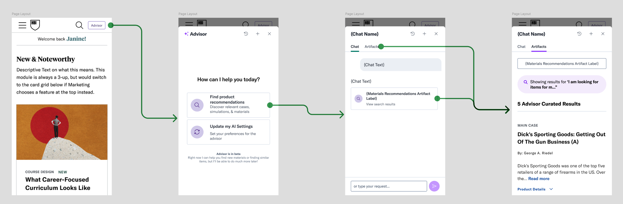
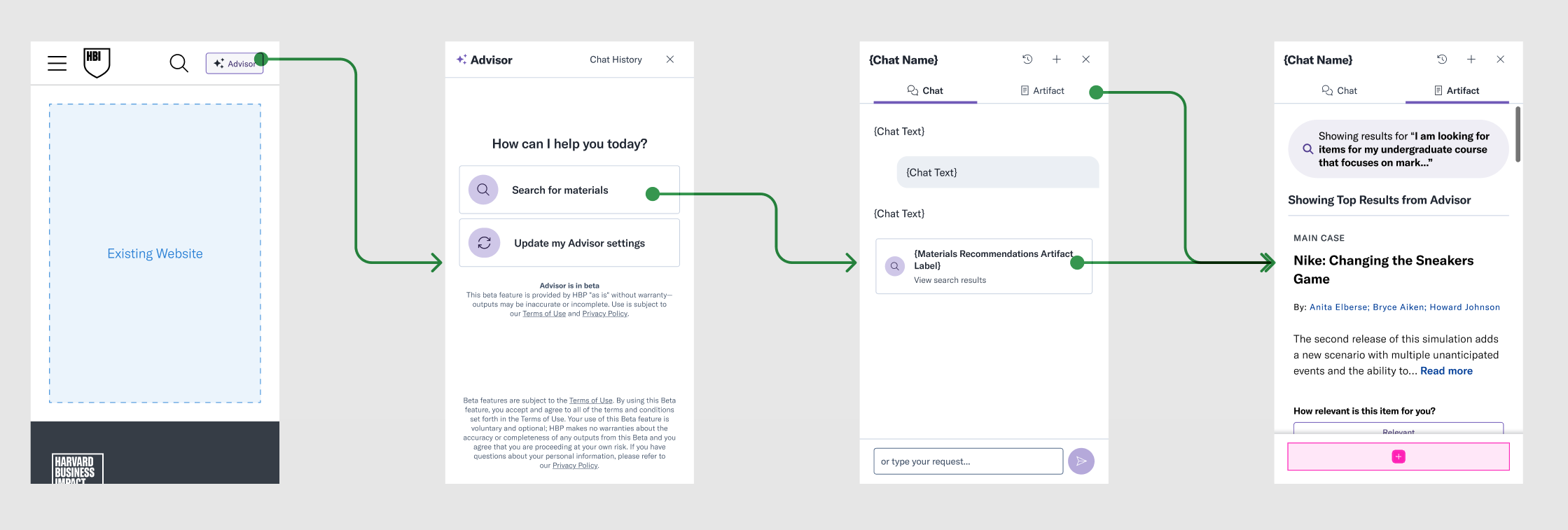
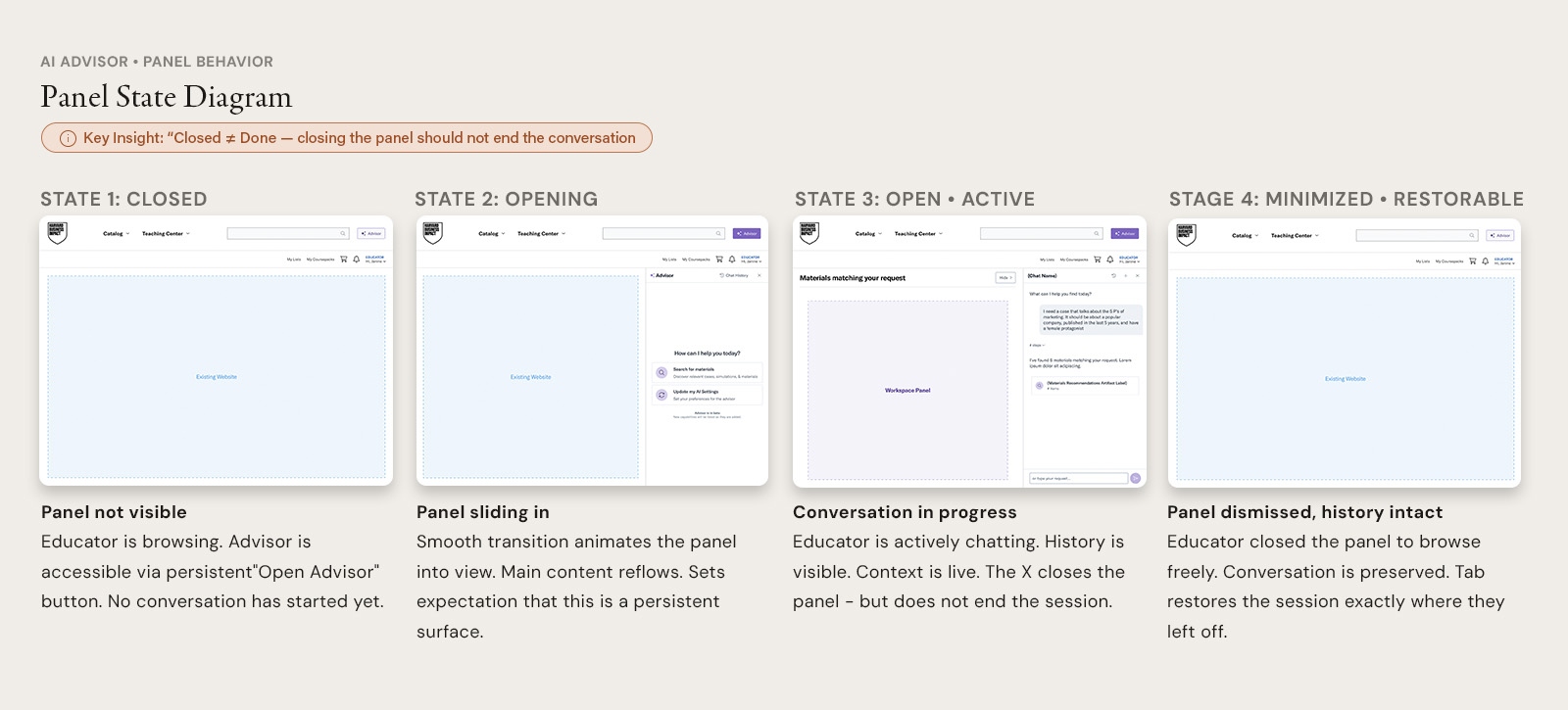
Where the Advisor lives on the page (April)
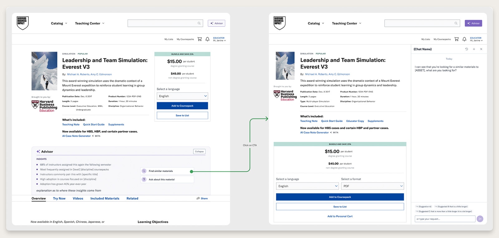
Four findings from the April moderated sessions changed the design direction:
- Closing the panel meant "done." Educators read closing the Advisor as ending the conversation. We changed the panel so it restores with its history intact instead of resetting.
- The embed became a quality signal. When a product page had no Advisor embed, educators assumed that product mattered less. That turned the rollout from a feature decision into a question about the whole catalog.
- The entry point was easy to miss. Five of six participants didn't notice the Advisor button at first. Advisor CTAs now appear on product pages, in search, and inside Coursepacks.
- Mobile: preferred one layout, shipped another for now. Twenty-eight educators tested three mobile layouts. They preferred an overlay that slides up from the bottom and leaves part of the site visible. We shipped a full-page mobile experience first and scheduled a redesign toward the preferred layout.
Testing the live model (May)
With a working model, I interviewed 11 educators across 7 countries. Each used it on their own real course needs.
The core value held up. All 11 said they would use the Advisor over traditional search. The standout moment was the Advisor retrieving and displaying the cases, not just recommending them. Educators didn't expect that. Time saved was the main draw.
Trust was fragile in specific ways:
- The same prompt sometimes returned different cases.
- Asking for the "best" cases didn't surface known bestsellers.
- Educators assumed the top result was the best match, even when it wasn't.
- In one session, the Advisor invented a framework that doesn't exist. For a Harvard-branded tool, that's a serious risk.
"Transparency repaired trust. Educators trusted the Advisor more when it admitted a limitation — such as noting that a case had no stated learning objective. The 'Why is this listed' explanation drove confidence across nearly every session."
Responses also ran long, and context degraded after about three rounds of refinement. Many educators thought the thumbs up/down rated the model's explanation, not the recommended material.
| Evidence | Decision |
|---|---|
| Long responses that restated the result cards | Model defaults to brevity, detail on demand (shipped) |
| No quality signal for bestsellers | Bestseller and Classic tags in results (shipped) |
| An invented framework | Guardrails on frameworks and case claims (shipped) |
| Top result assumed to be the best | "Showing Top 5 Results" label, plus "Load more" |
| Feedback read as rating the explanation | Feedback control moved to clearly rate the material |
The alpha: honest results (June)
Educators used the Advisor for two to four weeks. The results were moderate, not a clear win:
- Post-use (n=34): relevance averaged 3.53/5, and explanation accuracy averaged 3.59/5.
- Two-week wrap-up (n=24): satisfaction averaged 3.32/5, and "met expectations" averaged 3.05/5.
The drop wasn't uniform. A small group grew more enthusiastic over the two weeks, a similar group grew more frustrated, and most stayed where they started.
"Real use contradicted the moderated sessions. In May, five results felt like the right number for a broad-then-narrow search. Over weeks of real use, the five-result cap became the most common complaint. What people say in a session isn't how they behave on their own."
Educators also said results felt generic across course levels, and the Advisor struggled with thematic or niche queries. The July follow-up added the why: gaps in retrieving specific named cases, and a wish for a confidence signal. At least one educator said general-purpose AI tools still felt more capable for open-ended work — a retention risk the Advisor has to close with what only it has: HBP's content and its explainability.
Before beta, we made two changes:
- We redesigned the feedback mechanism to ask specifically about relevance, rather than folding it into a general question.
- We made language and model updates based on how educators actually prompted.
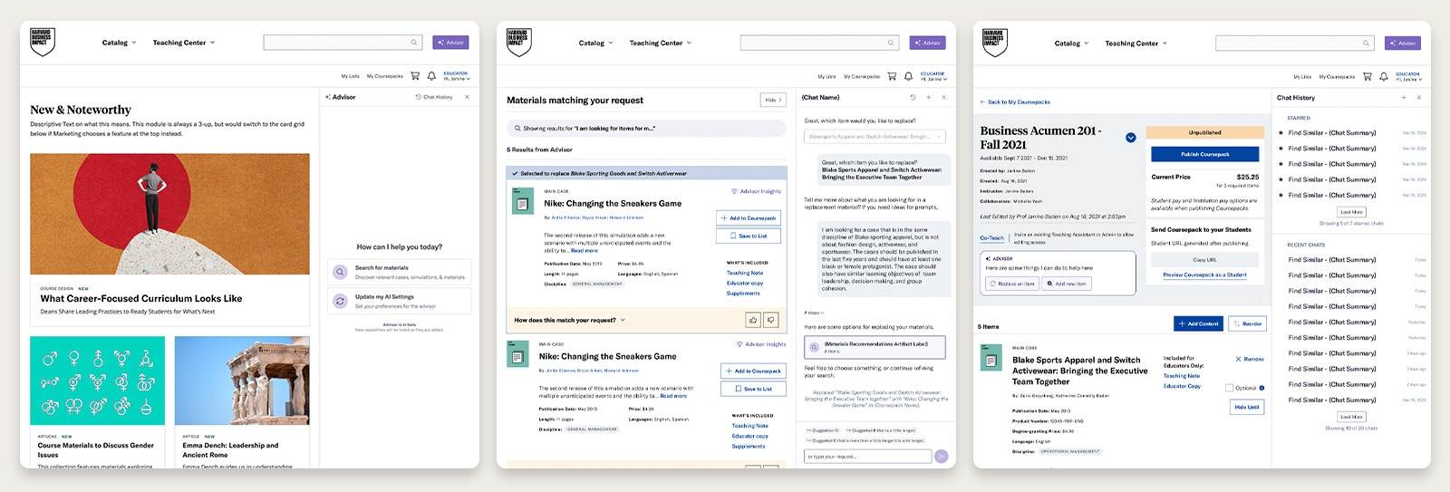
Beta (August 6 onward)
The beta rolled out to 1,000 educators, then expanded to about 150,000. As of September 28:
- Cumulative users: 5,772 — 58% of a 10,000-user target for end of December
- Active chats: 8,068
- Open-to-active-chat rate: 74%
- Average turns per session: 3.2 overall, 5.2 over the last 7 days
- Repeat rate (2+ sessions): 19%

Most educators who open the Advisor engage with it, and recent sessions run longer than the overall average. The "Search with Advisor" CTA on the search page accounts for 51% of all Advisor opens — educators use it most where they're already looking for materials. That supports spreading entry points across the site rather than relying on a single button.
The open questions are reach and return. We're just past halfway to the user target, and about one in five users has come back for a second session.
Job 2: Bringing Case Notes into the Advisor
The fork
Standalone Case Notes launched in January 2026. Its strongest signal was customization: 75.9% of notes included educator input on level, goals, or teaching style. That input came from a form.
The May sessions had already pointed away from the form. Educators strongly preferred a conversational planning mode. They wanted to confirm the AI understood them before it produced a full output. They also asked for more than retrieval: updating cases to current contexts, localizing them, and changing their length.
"Conversational" still left the core question open. We saw two ways to build it:
- Version A: generate a complete default note, then refine it.
- Version B: have a short planning conversation first, then generate.
A reaches an output faster. B asks more up front but could get closer to what the educator actually needs.
Concept test (July)
I interviewed five educators who had completed the alpha and showed them both flows as Figma prototypes.
Four of five preferred the guided flow. They said building the note section by section made it easier to trust and adjust. One compared it to building with Legos.
- Most still planned to read the case themselves — a generated note was something to prepare with, not a replacement for knowing the material.
- Customization centered on pacing and structure: passage length, question count, question order and priority, and course level and format.
- They wanted notes that stay editable, not a static handout.
- Several educators independently asked to reorder discussion questions by dragging them.
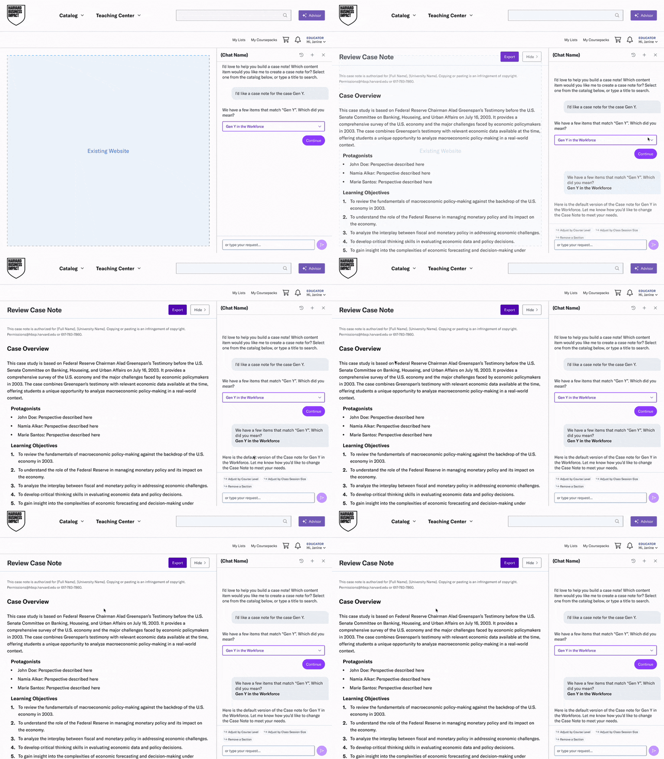
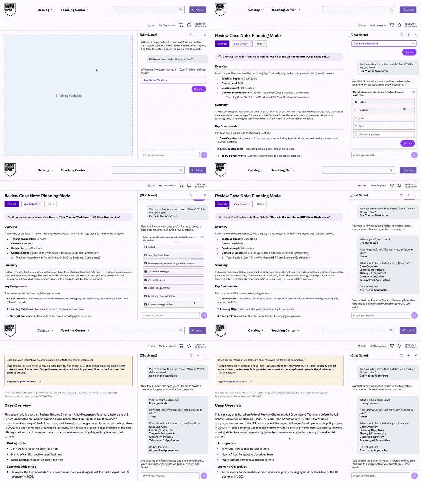
Five participants who had opted into the alpha is enough to choose a direction. It isn't enough to generalize to all faculty.
| Evidence | Insight | Decision |
|---|---|---|
| May: educators preferred planning over forms. July: 4 of 5 chose the guided flow | Educators trust a note more when they shape it before it exists | Planning Mode |
| Needs centered on structure and pacing | Educators want to agree on the note's shape before reading all of it | Outline step before generation |
| Educators wanted editable notes | Regenerating the whole document is too blunt | Section-level revision |
| Several asked to drag questions into a new order | A real need, but not a blocker | Backlog. Prioritized shipping more capability sooner; watching analytics to decide what's next. |
The drag-to-reorder call reflects how this team works. We phase features deliberately because the work spans AI, front-end, and back-end engineering, each with its own constraints and deadlines. UX designs the full experience, then negotiates what ships when.
Hands-on alpha: did the decisions hold up? (September)
Eight educators from the Educator Advisory Team used the built skill in a staging environment. Each created at least one note on their own, then joined a 45-minute interview. The group mixed prior alpha testers with educators new to hands-on testing.
Reception was positive-to-mixed. Six participants offered a rating out of 5 when asked, and five of those six put it between 4 and 5. The lowest started at 2.75 and rose to 3.5 after revision. No one said they would stop using the tool, and most planned to work it into their prep in some form. Most also didn't see it as a full replacement for a human-written teaching note. Several described using it for idea generation, or as a customization layer on top of the existing note — a different kind of preparation help than we set out to build, and worth designing for.
Four of eight called it a major advance over the standalone Case Notes tool they had tested 6–12 months earlier.
What held up
- Section-level revision was the most-praised part of the flow. Six of eight mentioned it positively, often contrasting it with tools that rewrite the whole document when you ask for one change. The July decision worked. But several educators found it only by trial and error — an onboarding gap rather than a problem with the mechanic.
- Getting from nothing to a note took little effort. Five of eight praised how quickly they had a full draft.
- Depth of content. Four educators rated the content favorably against notes they had written themselves or output from other AI tools. One case author said it was better than what she could write.
What didn't hold up
- The outline step was the most common point of confusion. Four of eight didn't realize the first output was a draft outline to confirm, not the final note. We simplified the outline page, titled it "Outline," gave it a light yellow background, and changed its artifact card to a yellow icon. We also added "Outline" tags and more iconography so the draft state doesn't depend on color alone. The changes reduced the confusion but didn't resolve it.
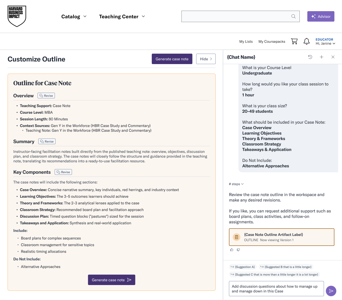
Updated outline step — yellow artifact card and Outline label added to signal draft state - Generation was slow. Four of eight flagged this directly. Several couldn't scroll back to read earlier sections while generation ran, and there was no way to stop it partway through.
- Chat and section revision behaved differently. A general chat request could rewrite the entire note, even when the educator explicitly asked it not to. The same change made through a section's Revise button worked as expected.
- Instructions weren't reliably followed the first time. Three educators had explicit requests — such as a SWOT analysis or a page limit — ignored on the first pass.
- The Advisor didn't ask enough about the course. Five of eight wanted it to account for class size, course level, modality, or the geography of examples.
- Saving works, but notes are hard to manage over time. What educators missed: labeling versions by use, an undo for unwanted rewrites, and having a note follow its case into a Coursepack.
"One educator said he'd cancel his paid general AI subscription if the Advisor matched its quality. The same retention risk from Job 1 applies: content depth is the Advisor's advantage, and conversational polish is where it falls behind."
From alpha to beta
| Finding | Status for October 26 beta |
|---|---|
| Slow generation | Shipping |
| Instructions not followed first time | Shipping |
| Frameworks mostly from Harvard-affiliated, US-based authors | Shipping: broader non-US representation |
| Didn't build enough on the existing teaching note | Shipping. The model already uses the existing note but was favoring customization over it. Balance adjusted. |
| Missing course context; no agreement on which details matter most | Direction set, backlogged: make the outline step the place to customize, rather than adding more questions up front |
| Outline not recognized as a draft; stop control; chat vs. section revision; custom sections; versioning and Coursepack linkage; TXT export | Backlog for future releases |
The UX fixes were deliberately held so the Advisor's two biggest skills — search and Case Notes — could both launch. They're scheduled to follow shortly after the Case Notes beta.
Impact
Job 1
- 5,772 cumulative users — 58% of a 10,000-user target for end of December
- 8,068 active chats
- 74% open-to-active-chat rate
- 3.2 average turns per session overall; 5.2 over the last 7 days
- 19% repeat rate (2+ sessions)
Job 2
Section-level revision held up under hands-on use, and four of eight educators called the integrated experience a major advance over the standalone tool. Four model issues from the alpha ship with the October 26 beta.
Standalone Case Notes exceeded all five of its CSAT targets at launch. 85% of users said it saved them time, against a target of 70%.
Reflection
- Moderated sessions and real use disagreed. The five-result cap is the clearest example, and it's why every study now pairs what people say with what they do.
- A research-backed decision still needs its own testing. The outline step came directly from the July findings, the first version was completely confusing, and it had a learning curve even after the September changes. The idea was right. How the Advisor presented it wasn't. Decisions need to be tested again once they're built, not treated as settled.
- Planning before creation keeps surfacing. It came up in May, in the alpha surveys, in the July concept test, and again in September. It appears to be a pattern for the whole Advisor, not just Case Notes.
- Moderate scores were more useful than a win would have been. The Job 1 alpha split showed who the Advisor wasn't serving yet. In September, "a customization layer, not a replacement" told us more about how educators will actually use Case Notes than a high rating would have.